


Increased understanding
Our tool can help you to increase understanding of your data by presenting it in a visual format. This can be especially helpful for audiences that are not familiar with data analysis.

Improved decision-making:
Our tool can help you to improve decision-making by providing you with insights into your data. This can help you to allocate resources more effectively, target your marketing campaigns more precisely, and improve your product development process.

Enhanced communication
Our tool can help you to enhance communication by providing you with visualizations that are easy to understand and interpret. This can help you to share your data with others and to get buy-in for your ideas.

Increased engagement
Our tool can help you to increase engagement by creating visualizations that are visually appealing and informative. This can help you to keep your audience's attention and to encourage them to learn more about your data.

Improved brand image
Our tool can help you to improve your brand image by creating visualizations that are professional and polished. This can help you to build trust and credibility with your audience.

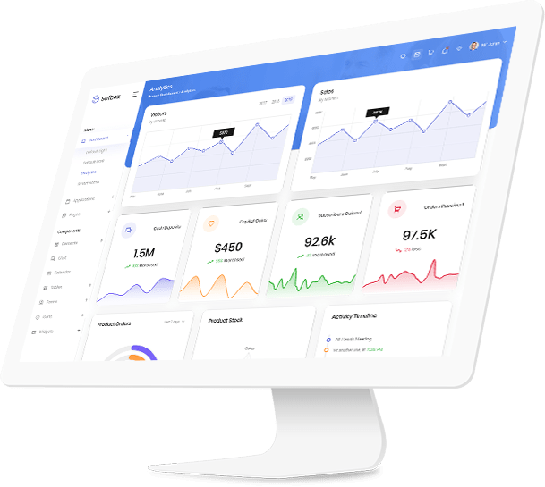
Rich Collection of Visualizations
Our SaaS tool offers a rich collection of visualization options, ranging from basic charts like bar graphs and pie charts to advanced visualizations like heatmaps and tree maps. With a diverse set of visualization choices, you can select the most suitable representation to showcase your data insights effectively.

Interactive Dashboards
Create interactive dashboards that put the power of exploration in the hands of your users. Our platform allows you to build dynamic dashboards that enable users to interact with data, apply filters, and drill down into specific data points to gain deeper insights.

Real-Time Data Visualization
Stay up-to-date with the latest data through real-time data visualization. Our SaaS tool enables you to connect directly to your data sources and visualize real-time data changes, empowering you to make informed decisions on the fly.

Mobile-Friendly Visualizations
Access your visualizations anytime, anywhere, on any device. Our SaaS tool ensures that your visualizations are optimized for mobile devices, enabling you to stay connected and make data-driven decisions even on the go.

Collaborative Visualization
Collaborate seamlessly with your team using our collaborative visualization features. Share interactive visualizations and dashboards with your colleagues, allowing them to provide feedback, add comments, and work together to derive insights collectively.

Data Storytelling for Viewers
Transform your data into compelling data stories that resonate with your audience. Our visualization tools allow you to arrange visual elements in a narrative flow, guiding viewers through the data to understand its significance and implications better.

Start Your Journey
Lets Coredata AI guide your steps in the right direction
 (1)")
Get in Touch
Contact us today and find out how Coredata AI can help your business grow.